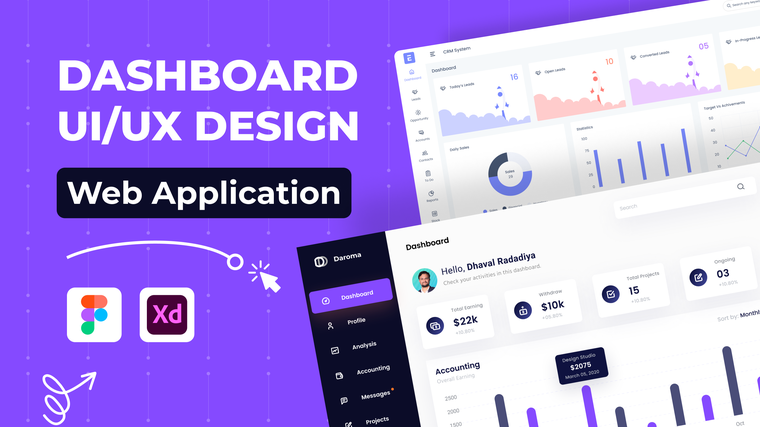
Dashboards are the heart of many SaaS products—but they’re also one of the hardest interfaces to design well.
Great dashboard UI/UX design doesn’t just display data. It helps users understand it, prioritize it, and act on it.
Why Dashboard UX Is Often Overlooked
As SaaS products evolve:
- New metrics are added
- Features expand
- Interfaces become cluttered
Without thoughtful UX design, dashboards quickly overwhelm users.
Core Principles of Effective Dashboard UI/UX Design
1. Prioritize What Matters Most
Not all data is equally important.
Strong dashboard design:
- Highlights key metrics
- Pushes secondary data to supporting views
- Avoids information overload
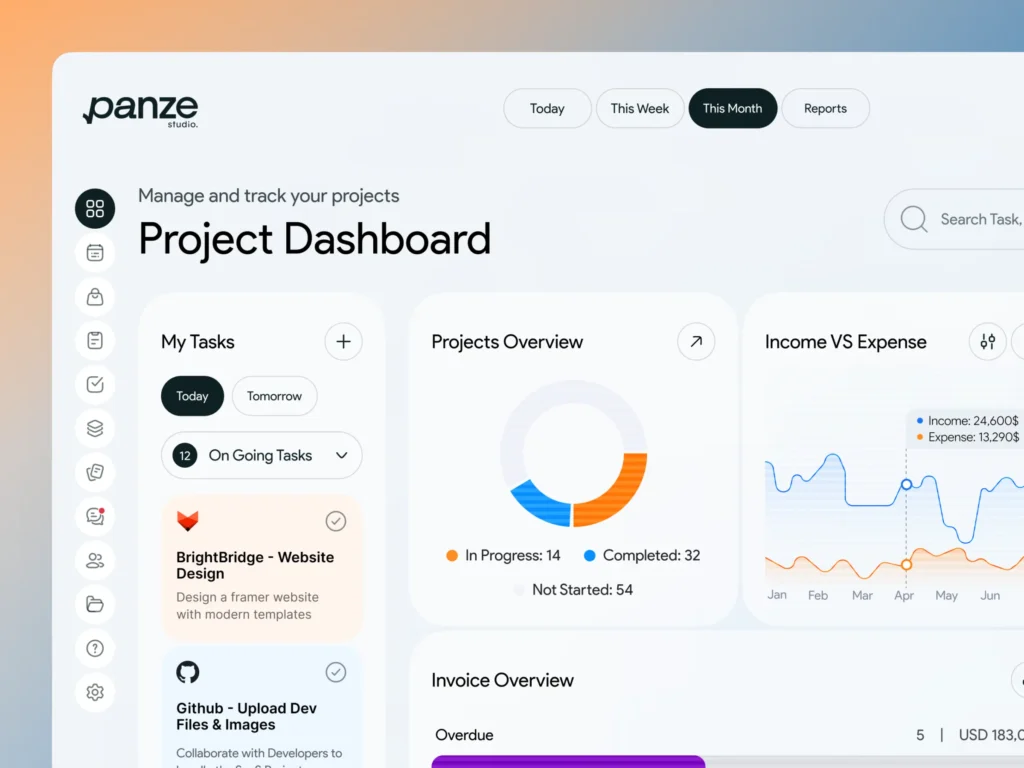
2. Design for Scanning, Not Reading
Users scan dashboards quickly.
Good UI/UX designers use:
- Visual grouping
- Clear contrast
- Consistent layouts
This allows users to extract insights in seconds.
3. Match Design to User Roles
Different users need different data.
Role-based dashboards:
- Reduce clutter
- Improve relevance
- Increase usability
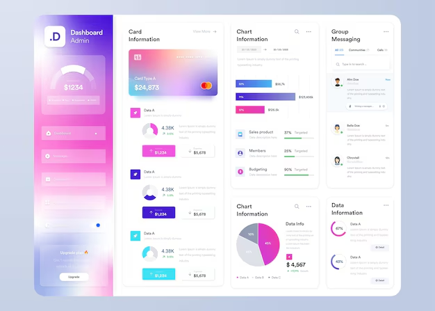
Common Dashboard UX Mistakes
- Too many charts on one screen
- Poor visual hierarchy
- Inconsistent data presentation
- Lack of context or explanations
Professional UI/UX designers know how to avoid these pitfalls.
How Expert Designers Improve Dashboard UX
Experienced dashboard designers:
- Redesign layouts based on user behavior
- Simplify data visualization
- Optimize dashboards for decision-making
Fiverr Pro
Many Fiverr Pro designers specialize in SaaS dashboards and analytics interfaces.
Final Thoughts
A well-designed dashboard transforms data into clarity.
For SaaS products, investing in professional dashboard UI/UX design improves usability, adoption, and long-term value.
👉 How UX audits and redesigns improve SaaS retention